When it comes to photography, choosing complimenting colors can really elevate a photo. Colors can evoke different emotions and convey different moods, and using the right colors can help you create images that are more compelling, impactful, and memorable.

Why Choosing the Right Colors is Important in Photography
Sets the Mood:
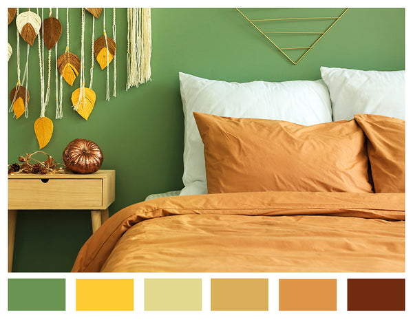
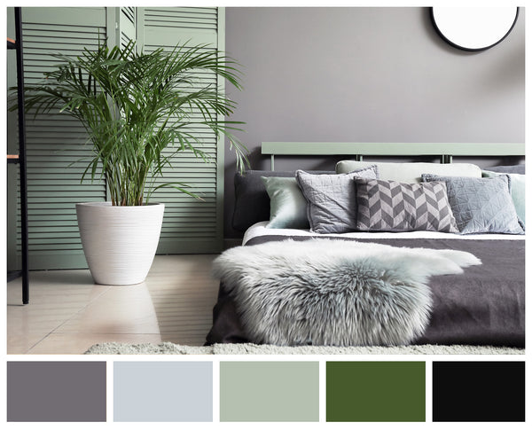
The colors you choose can help set the mood of your photo. For example, warm tones like red, orange, and yellow can create a feeling of warmth and intimacy, while cool tones like blue and green can create a more calming and soothing mood.
A great resource to find ideas would be color schemes found on Pinterest or even the paint section in the hardware store.
Notice the tones in the rooms below and how they both give off a different vibe/mood.
Emphasizes Key Elements:
Using color can help emphasize key elements in your photo, such as the subject or a particular feature. By using contrasting colors, you can create visual interest and make certain elements stand out.


Creates Depth:
Color can also create a sense of depth in your photos. By using warmer colors in the foreground and cooler colors in the background (or vice versa), you can create a sense of distance and depth in your images.

Creates Visual Interest:
Using the right colors can make your photos more visually interesting and engaging. By playing with complementary colors or using color to create patterns or textures, you can create images that are more dynamic and eye-catching.
Here's a diagram that might help when putting colors together:

Tips for Using Complementing Colors in Photos
Consider the Subject:
When choosing colors for your photos, consider the subject and the mood you want to convey. If you're photographing a landscape, for example, you may want to use cool colors to create a sense of calm and tranquility.


Use Contrasting Colors:
To create visual interest and make certain elements stand out, use contrasting colors. For example, if your subject is wearing a blue shirt, consider using a yellow or orange background to create contrast.

Use Color Grading in Post-Processing:
Color grading is the process of adjusting the color balance and hues in your photos to create a desired look or mood. Experiment with different color grading techniques to achieve the desired effect in your images.


Pay Attention to Lighting:
Lighting plays a big role in how colors are perceived in your photos. Pay attention to the lighting conditions when shooting, and adjust your camera settings or lighting setup as needed to achieve the desired color balance.

I hope this gives you some ideas, now time to grab your camera and take some photos!